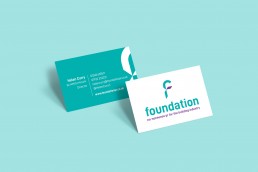
Foundation is a small, 20-years established PR agency, specialising in b2b in the construction industry. They were looking to update their logo to something fresher, yet retaining a ‘no-nonsense’ feel to their brand. Their target audience is predominantly male, but they wanted to keep a feminine touch to differentiate themselves.
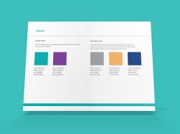
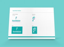
The resulting logo is strong, dynamic and forward-looking, reflected by the angles introduced throughout the ‘f’ icon. The colours ensure it retains some femininity but is not overly so.
The final logo was supplied along with brand guidelines, and I also designed double sided business cards to help roll out the physical rebrand.
ClientFoundation PRRoleLogo and business card designFormatPrint